

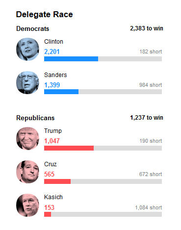
Here’s a completely bogus chart that was displayed on the Yahoo News site yesterday. Every line has a different scale. What can a chart mean where every line has a different scale? What does it tell you?
Probably not what you think it tells you. Be careful, news folks apparently are playing fast and loose with intelligence and logic in this election year.
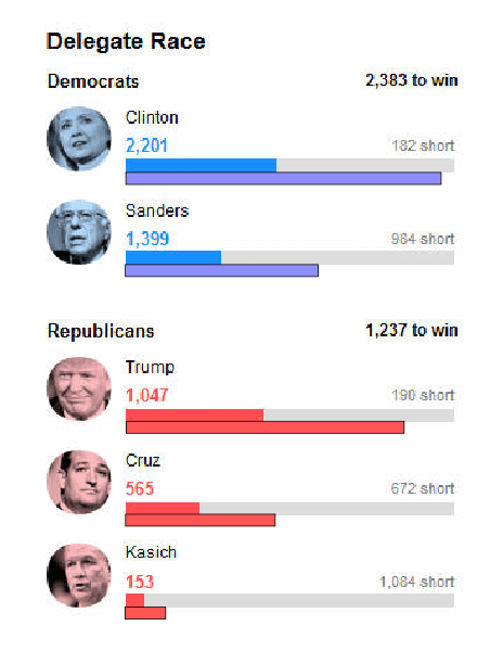
Update: Here is the chart corrected with bars with a constant scale added. Of course the Democratic and Republican scales are different because their “to win” numbers are different. But as you can see by looking at the bars I’ve added below each original bar, the original bars are drawn with different scales. The added bars are all scaled to the “to win” maximums.
Why would Clinton and Trump show at about 50% when they have than 80% of the delegates required? And why would Sanders, Cruz and Kasich be scaled lower than they should be?
It’s not clear what message the original chart was trying to get across, but it’s clearly misleading.
: ww
